

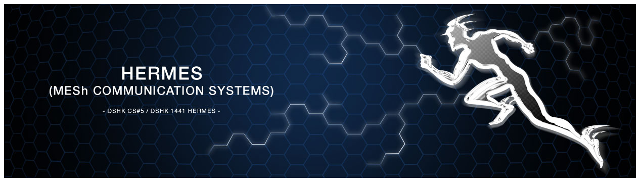
DSHK CS#5 / DSHK_1441_HERMES
After very quick development this was then re-created in a vector based, digital format. This would allow us to do what we needed with the icon. For the full colour treatment, we took it into Photoshop and created and applied a metallic chrome effect combined with bevels and a minimal drop shadow, this gave it the desired look of molten quick silver. A second layer, a mesh effect was applied as a tint, giving the logo a feeling of robust digital technology and speed. The contrast against a black background, with subliminal honeycomb MESh texture completed the full colour treatment.


HERMES: HIGHLY ENCRYPTED RAPID MESh COMMUNICATION SYSTEM
 |
| WELCOME TO HERMES THIS PROJECT WAS OPTIMISED FOR PRESENTATION EXCLUSIVELY ON A LAPTOP |
- BRIEF -
This 5G communications system was named Hermes after the God of transitions and boundaries. Hermes was quick and clever and moved freely between the worlds of the mortal and divine, as emissary and messenger of the Gods. This then was the perfect name for this LMDS (Local Multipoint Distribution System) that was set to revolutionise comms in dangerous, hazardous and difficult terrain, including warzones and natural disaster environments.
The brief was to create a brand for this product, ready for meetings with investors in 7 days time. Required was brand development to include multiple formats i.e. short-fat, long-thin. The brand also needed to be developed for full colour and black and white uses, both positive and negative. They needed it to be presented as spec sheets showing the brand in its different formats.
An 8pp corporate brochure designed and 16 off copies printed was also required, along with an 8pp website including an animated Flash introduction.
- THE GOAL -
To create a look, feel and image for a product that at the time was by all accounts, a suitcase full of technology. We wanted to create the impression of dynamism, speed and leading edge technology, appropriate to defence and emergency services.
In this case there wasn't any time for a plan of action. We had to fly by the seat of our pants, drawing on instinct and experience where we could.
ASSETS REQUIRED:
• Brand development
• Corporate brochure 8pp and delivered in print
• Website 8pp
- THE BRAND -
 |
| HERMES BRAND REFERENCE (mythology.wikia.com) |
For this project and with the deadline looming, the first go-to was classical Greek iconography for the deity ‘Hermes’. Research was quickly conducted and a custom hand illustration produced in-house. This included all the elements to identify the illustration as Hermes, but in the form of a simple silhouette in action, with almost comic book and heroic qualities.
 |
| HAND DRAWN, VECTOR-BASED ILLUSTRATION VIA AI |
 |
| HERMES BRAND, BLACK AND WHITE, POSITIVE (B/W-POS) |
 |
| HERMES BRAND, BLACK AND WHITE, NEGATIVE (B/W-NEG) |
 |
| HERMES BRAND, FULL COLOUR, NEGATIVE (CMYK/RGB-NEG) |
- THE BROCHURES -
Due to the longer lead time from design to finished artwork and print, the brochure needed to be next on the agenda. A simple bullet-point design was used for the page layouts, minimising the time to write copy and to set for artwork. Established devices such as the logo and the black colour way were used for the cover, but the more conventional, easier to read styling of black text on white was used for the content. A honeycomb graphic for page backgrounds was created in a 3D application and applied throughout the brochure to reinforce the MESH technology theme. Artwork was delivered to the printers by hand, printed overnight and ready for pick-up and delivery the next day.
- CONCEPT / THE CREATIVE SITE -
The look and feel for the website had been established with the brochure design and it was just a case of reimagining it to a computer friendly, landscape format. A crowd pleasing animated intro took the largest part of the website development, as it would give the presentation something of a wow factor. It predominately featured the Hermes logo and the honeycomb MESH which featured information pulsing through the MESh network.
The layout of content pages followed the theme of the brochure, with the Hermes logo, mission statement and strap-line visible from all pages within the site. The main navigation for the website was by way of a simple horizontal menu, always on view at the top of the page. A secondary web wizard "Next Section" button was included at a later stage, as this aided the demonstration of the site on a laptop.
- THE RESULTS -
All aspects of the project were completed on time and handed over to the client ready for next stage development. The project was deemed to be 100% successful with the designers of the Hermes system sufficiently impressed with the concept, implementation and speedy turn-around of the presentation, to enable our client to take the Hermes project to the next successful outcome.
In this case it was not appropriate for this data to be made available.
